English
 Deutsch
Menu
Manuals
Thread Dashboard
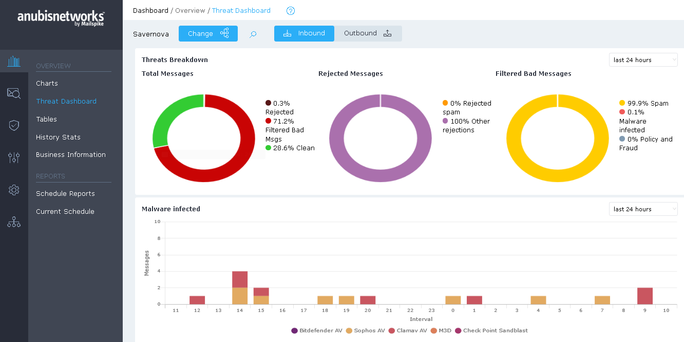
The Dashboard section shows graphical representations of the classification and volume of data for different periods (last 24 hours, last 30 days and last year are as options available). The section provides a clearer view of the Dangerous emails detected by our filtering.
The graphics always refer to the selected hierarchy scope.
- Threats Breakdown
- Malware Infected
- Policy and Fraud Threats
- Spam Detection
The Threats Breakdown chart shows the actions that were performed on the email traffic. The possible Actions are summarized in the following table:
| Chart | Description |
| Total Messages | This chart looks at the total messages and divides these between clean and the messages that were considered bad, either at MTA level (Rejected) or at the Filtering pipeline. |
| Rejected Messages | On the Rejected messages, this chart distinguishes between the messages rejected because they eere considered Spam |
| Filtered Bad messages | For the messages that were not rejected and entered the filtering pipeline, this chart shows the classification of these bad messages. |